Data Visualization with Matplotlib on Python


import numpy as np
import pandas as pd
I am using the inline backend, if you want to modify the graph also after you have done it, don't use this command!
get_ipython().run_line_magic('matplotlib', 'inline')
import matplotlib as mpl
import matplotlib.pyplot as plt
For ggplot-like style:
mpl.style.use(['ggplot'])
df is the name of my dataframe
df.index = df.index.map(int) #maybe you have to change the index values to integer for plottin
0. TWO TYPES OF PLOTTING
Type 1:
df.plot([...])
plt.title([...])
plt.ylabel([...])
[...]
Type 2, more flexibility:
ax = df.plot([...])
ax.set_title([...])
ax.set_ylabel([...])
ax.[...]
1. LINEGRAPH
basic linegraph
df.plot()
Let's change something:
df.plot(kind='line')
plt.title('TITLE')
plt.ylabel('Y LABEL')
plt.xlabel('X LABEL')

#add an annotation - syntax: plt.text(x, y, label)
plt.text(2000, 6000, 'ANNOTATION')

plt.show()   #need this line to show the updates made to the figure
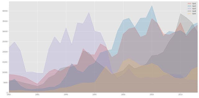
2. AREA PLOTS
df.plot(kind='area',
             alpha=0.25,   #transparency between 0 and 1, default value 0.5
             stacked=False,   #Area plots are stacked by default
             figsize=(20, 10)   #pass a tuple (x, y) size
             )
3. HISTOGRAMS
df.plot(kind='hist', figsize=(8, 5))
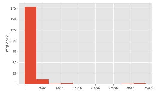
Help for choose bins number:
bins = np.histogram(df['column'], bins=5)   #divide into 5 bins and give the count
df.plot(kind='hist', figsize=(8, 5), xticks=bins)
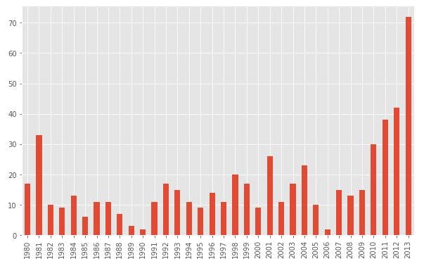
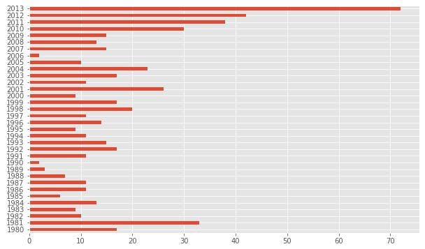
4. BAR CHARTS
Vertical:
df.plot(kind='bar', figsize=(10, 6))
Horizontal:
df.plot(kind='barh', figsize=(10, 6))
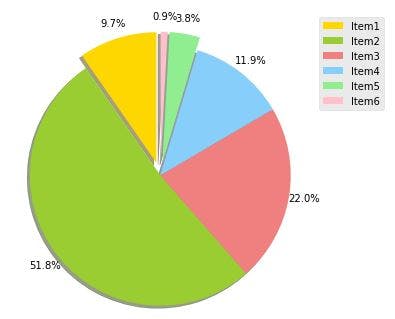
5. PIE CHARTS
Pie charts are evil
But here is the code:
df['col1'].plot(kind='pie',
                            figsize=(5, 6),
                            autopct='%1.1f%%',   #value in the plot in thar format
                            startangle=90,   #start angle 90°
                            shadow=True,   #add shadow
                            labels=None,   #turn off labels
                            pctdistance=1.12,   #distance between the center of each pie slice and the text
                            )
we can choose colors and make more importance to some slice with this:
colors_list = ['gold', 'yellowgreen', 'lightcoral', 'lightskyblue', 'lightgreen', 'pink']
explode_list = [0.1, 0, 0, 0, 0.1, 0.1]   #ratio for each slice

df['col1'].plot(kind='pie',
                            figsize=(5, 6),
                            autopct='%1.1f%%',    #value in the plot in thar format
                            startangle=90,    #start angle 90°
                            shadow=True,    #add shadow
                            labels=None,    #turn off labels
                            pctdistance=1.12,   #distance between the center of each pie slice and the text
                            colors=colors_list,   #add custom colors
                            explode=explode_list    #'explode' 3 items
                            )

#for adding legend
plt.legend(labels=df.index, loc='upper right')

plt.show()
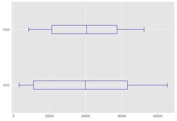
6. BOX PLOTS
df['col1'].plot(kind='box', figsize=(8, 6))
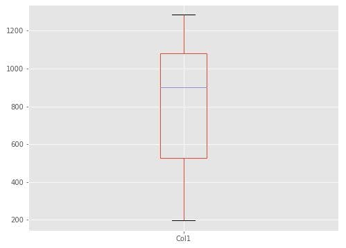
Horizontal box plots with some adjustments:
df.plot(kind='box', figsize=(10, 7), color='blue', vert=False)
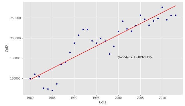
7. SCATTERPLOTS
df.plot(kind='scatter', x='col1', y='col2', figsize=(10, 6), color='darkblue')
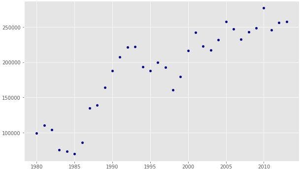
We can add a regression line to see the trend:
x = df['col1']      #item on x-axis
y = df['col2']     #item on y-axis
fit = np.polyfit(x, y, deg=1)   #Degree of fitting polynomial. 1 = linear, 2 = quadratic, ...

#plot
df.plot(kind='scatter', x='year', y='total', figsize=(10, 6), color='darkblue')

#plot line of best fit
plt.plot(x, fit[0] * x + fit[1], color='red')
plt.annotate('y={0:.0f} x + {1:.0f}'.format(fit[0], fit[1]), xy=(2000, 150000))

plt.show()
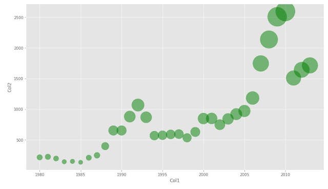
8. BUBBLE PLOTS
df.plot(kind='scatter',
                    x='col1',
                    y='col2',
                    figsize=(14, 8),
                    alpha=0.5,      #transparency
                    color='green',
                    s=df['col3']      #pass weights
                   )
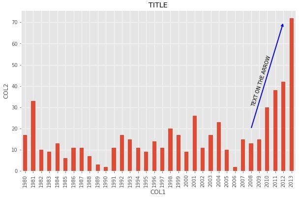
ANNOTATION EXAMPLE
df.plot(kind='bar', figsize=(10, 6))
plt.xlabel('X')
plt.ylabel('Y')
plt.title('TITLE')
Annotate arrow:
plt.annotate('',     #leave it blank for no text
             xy=(32, 70),     #place head of the arrow at that point
             xytext=(28, 20),     #place base of the arrow at that point
             xycoords='data',     #will use the coordinate system of the object being annotated
             arrowprops=dict(arrowstyle='->', connectionstyle='arc3', color='blue', lw=2)
            )
Annotate Text:
plt.annotate('TEXT ON THE ARROW',    #text to display
             xy=(28, 30),     #start the text at at this point
             rotation=72.5,     #based on trial and error to match the arrow
             va='bottom',     #want the text to be vertically 'bottom' aligned
             ha='left',     #want the text to be horizontally 'left' aligned
            )

plt.show()
SUBPLOTS
To have multiple plots in the same figure.
fig = plt.figure()   # create figure

ax0 = fig.add_subplot(1, 2, 1)   #add subplot 1 (1 row, 2 columns, first plot)
ax1 = fig.add_subplot(1, 2, 2)   #add subplot 2 (1 row, 2 columns, second plot)

#Subplot 1: Box plot
df.plot(kind='box', color='blue', vert=False, figsize=(20, 6), ax=ax0) # add to subplot 1

#Subplot 2: Line plot
df.plot(kind='line', figsize=(20, 6), ax=ax1)  # add to subplot 2

plt.show()