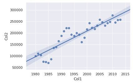
Regression Plots with Seaborn on Python


import seaborn as sns

ax = sns.regplot(x='Col1', y='Col2', data=df_tot)
We can use more features
import matplotlib as mpl
import matplotlib.pyplot as plt
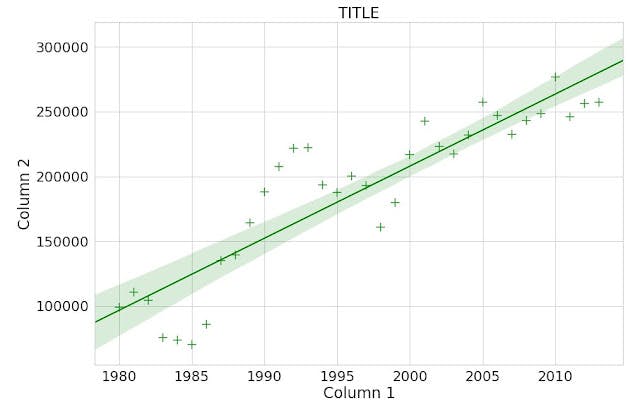
plt.figure(figsize=(15, 10)) #bigger graph
sns.set(font_scale=2) #bigger fonts
sns.set_style('whitegrid') #white background
#make "+" green bigger marker (with marker, color e scatter_kws options)
ax = sns.regplot(x='Col1', y='Col2', data=df_tot, color='green', marker='+', scatter_kws={'s': 200})
ax.set(xlabel='COLUMN 1', ylabel='COLUMN 2') #axis labels
ax.set_title('TITLE') #graph title