Waffle Charts with Python


import numpy as np
import pandas as pd
from PIL import Image #converting images into arrays
import matplotlib as mpl
import matplotlib.pyplot as plt
import matplotlib.patches as mpatches #needed for waffle Charts
mpl.style.use('ggplot') #optional: for ggplot-like style
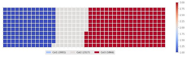
df #name of my table
Waffle charts are not built into any of the Python visualization libraries.
So we have to create a function for it:
def create_waffle_chart(categories, values, height, width, colormap, value_sign=''):
    #compute the proportion of each category with respect to the total
    total_values = sum(values)
    category_proportions = [(float(value) / total_values) for value in values]
    #compute the total number of tiles
    total_num_tiles = width * height #total number of tiles
    print ('Total number of tiles is', total_num_tiles)

    #compute the number of tiles for each catagory
    tiles_per_category = [round(proportion * total_num_tiles) for proportion in category_proportions]

    #initialize the waffle chart as an empty matrix
    waffle_chart = np.zeros((height, width))
    #define indices to loop through waffle chart
    category_index = 0
    tile_index = 0
    #populate the waffle chart
    for col in range(width):
        for row in range(height):
            tile_index += 1
            #if the number of tiles populated for the current category is equal to its corresponding allocated tiles...
            if tile_index > sum(tiles_per_category[0:category_index]):
                #...proceed to the next category
                category_index += 1

            #set the class value to an integer, which increases with class
            waffle_chart[row, col] = category_index

    #instantiate a new figure object
    fig = plt.figure()
    #use matshow to display the waffle chart
    colormap = plt.cm.coolwarm
    plt.matshow(waffle_chart, cmap=colormap)
    plt.colorbar()
    #get the axis
    ax = plt.gca()
    #set minor ticks
    ax.set_xticks(np.arange(-.5, (width), 1), minor=True)
    ax.set_yticks(np.arange(-.5, (height), 1), minor=True)

    #add dridlines based on minor ticks
    ax.grid(which='minor', color='w', linestyle='-', linewidth=2)
    plt.xticks([])
    plt.yticks([])
    #compute cumulative sum of individual categories to match
    #color schemes between chart and legend
    values_cumsum = np.cumsum(values)
    total_values = values_cumsum[len(values_cumsum) - 1]
    #create legend
    legend_handles = []
    for i, category in enumerate(categories):
        if value_sign == '%':
            label_str = category + ' (' + str(values[i]) + value_sign + ')'
        else:
            label_str = category + ' (' + value_sign + str(values[i]) + ')'

        color_val = colormap(float(values_cumsum[i])/total_values)
        legend_handles.append(mpatches.Patch(color=color_val, label=label_str))
    #add legend to chart
    plt.legend(
        handles=legend_handles,
        loc='lower center',
        ncol=len(categories),
        bbox_to_anchor=(0., -0.2, 0.95, .1)
    )

#Now to create a waffle chart, all we have to do is call the function create_waffle_chart.
#Let's define the input parameters:

width = 40     #width of chart
height = 10     #height of chart
categories = df.index.values     #categories
values = df['Col1']      #correponding values of categories
colormap = plt.cm.coolwarm      #color map class

#Call the function
create_waffle_chart(categories, values, height, width, colormap)     #call the function